Correos
logo restyle and advertisement
logo restyle and advertisement
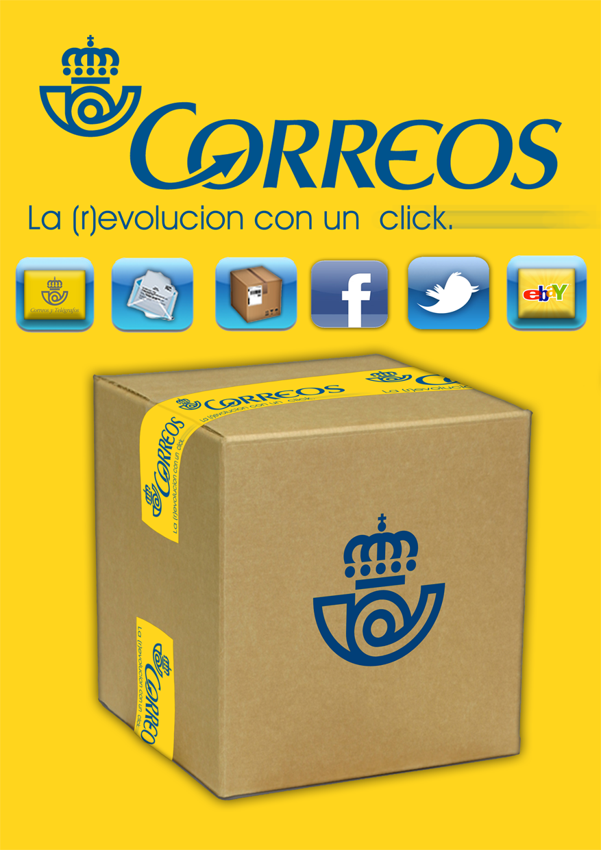
Preserve the classic image of Correos, with a minimal logo make up and a bit of modernity.
The official image of an institutional structure like the Spanish Postal service can not be distorted, then the change should be minimal but effective.
Dynamism and modernization should be the keywords for it's natural evolution. A revolution in picture, cool, fast, unobtrusive, always recognizable and which inspires confidence. All of this is the (R) Evolucion I have imagined. A small arrow in the logo to dynamize the name and all the icons of the new services, developed as a modern touch keys of a smartphone to communicate instantly around what now Correos can offer in terms of services, availability, performance and trends.
All the media that I have developed are in a graphical format, suitable for any kind of massive advertising.
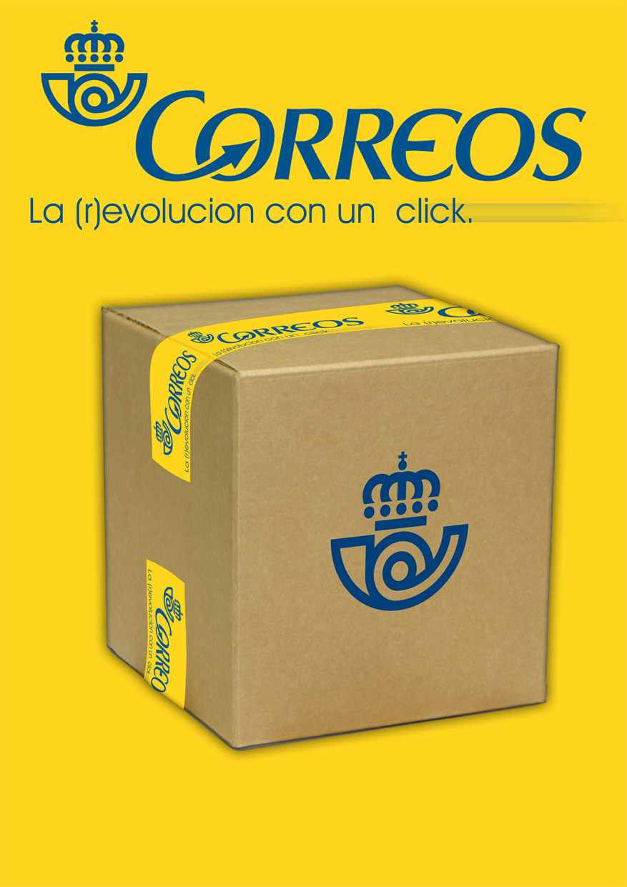